
DIGITAL MARKETING CAMPAIGN
OVERVIEW
PROJECT BRIEF
Project: Digital release for the EP, Four on the Floor
Cliff Beach was preparing to release a 4 song EP inspired by BLM, loss, motivation, and his journey through sobriety. This collection of tracks were remixed by guest DJs in the "4 on the floor" style, which for musicians means a steady emphasis on the quarter note pulse by the bass drum. This approach lends a driving energy that is heard today on some of today's hottest dance tracks.
In order to thread a cohesive look and narrative the designs were modeled after his brand colors (red + black) and reflected the edge of not only the emphatic rhythm but of the stories within his lyrics.
SPECS
-
RELEASE DATE: Mar 11th
-
CAMPAIGN DURATION: 2 months
-
OBJECTIVE: Drive subscriptions to Spotify and Youtube pages.
-
PLATFORM: Instagram, Facebook, Spotify, Youtube
-
ASSETS PROVIDED: Photo options, Music video, Tracks, Lyrics, Brand Logo
Timeline
Record releases for independent musicians develop a lot of momentum. They tirelessly promote at shows, through mailing lists, social media, and press. Releases are a big deal. These are opportunities to develop momentum and energy. A musician can translate that energy to sales, more gigs, more opportunities. The following 2 month timeline was created to couple with their efforts, ramp into the release date and maintain visibility and momentum into the following month.
Deliverables:
-
Videos: 14
-
Images: 6
-
AR Filters: 2
-
Notes/Tips: 4
SOCIAL MEDIA GUIDE
Notes, tips, and guidelines were given regarding hashtag usage, best times to post, caveats, scheduling tools, and captions. Here is an excerpt of a note provided to Cliff Beach and his team.

FEB 11th: 1 month out
Spotify Canvas Assets
The portrait videos are formatted for Spotify canvas. Canvas are the videos that loop as you play music on Spotify. One for each song. These were edited from the original music video that was created for the track "I Got Soul".
Teaser Trailer Video
The teaser trailer is meant to do just that-- tease. It is formatted for FB + IG feed and ads. It gives a glimpse into the new sound, look, and feel of the EP. It features the track, Black Moses, which I felt was a perfect way to introduce the project: driving rhythm and production building tension and letting Cliff Beach right out of the gate-- "You can call me Black Moses, I came to free my people"
FEB 25th: 2 weeks out


Album Artwork
Two weeks out from the release the album art was revealed. The lyrics of the album are self-reflective and, in that, examining how to navigate broader themes such as loss, substance abuse, and social/political issues. The design began with the BLM movement in mind staying true to his red and black branding. Newspaper headlines and articles of the unrest are surrounding him, it's contents unavoidable. His own story form him as well -- those are all the lyrics to the EP. The paper tear across his eyes reveal lenses that appear illuminated, which alludes to a new awareness. The original picture was chosen because it seems to be full of reflection, looking forward, and a sense of duty while still immersed in the fray. Four records laid out in the EP title representing the 4 tracks. The legs of "F" and "R" extend down (to the floor), pulling the eye back into the clockwise loop: Shoulder, hood, glasses, name, title, and over again.
The album cover was also rearranged for the Facebook banner.
FEB 25th: 1 week out
Promo Video
Building momentum with this promo video. Introducing the "call to action" by directing people to Spotify + Youtube. This has been formatted for social media newsfeeds/ads as well as for IG/FB stories.
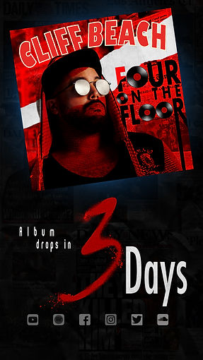
MAR 8th: 3 days out
Countdown Images
The last 3 days before the release the following 3 assets were formatted for IG/FB stories. With a 24 hour lifespan, this channel was perfect for a daily countdown.
The spray paint texture was chosen to tie in with the the protests, and civil unrest that was included in the initial design. The message of protest is usually written in spray paint against walls. It gives an urgency and underground feel.
MAR 9th: 2 days out

MAR 10th: 1 day out

MAR 11th: Day of release
Ads + Promo
On the day of the release Cliff Beach will have the direct links from Spotify and Youtube to promote with. Along with those links these assets were created to show the complete context and accessibility: the different platforms, sample track & creative content. Now the CTA is put into action.
Above is the story version. Below is the format created for the social media ads:

Spark AR Filters
The best type of advertising usually comes directly from your social circle. The things you see your friends buying, saying, doing, etc you are more likely to look into. If you can provide a way for people to express themselves with your product/message that inclusion and personalization is invaluable. AR bridges that gap and it was fun to develop these ideas. One was for his fans. The second was developed for him personally.
The fan-facing version invites the fans participate: dance or lip-sync. It can have up to two people. The original idea was to have the people placed inside the album cover singing and dancing, but the segmentation masking isn't that effective yet with this program (if there is a lot of movement happening). Instead, the glasses from the album cover were modeled and tinted red and black. The microphone is a subtle suggestion to sing along. The audio clip was chosen because it is the fan participation segment of the song, "clap your hands if you know that you got soul." Just below the demo you will see the icon created for the Spark AR filter. It's meant to be simple and immediate. Blue was opted for black since the glasses frames disappeared. It will be cropped into a circle and is formatted to the Spark AR Specs.

The artist-facing filter was created for him to send quick updates to his fans in a ready-branded video. No need editing videos to include logos or colors.
Behind him is the EP title he is releasing and updating fans about. The filter helps keep the EP at the forefront of people minds, makes the imagery recognizable, and is an easy way to create more content. The background for the Spark AR icon (below) was changed from black to blue to keep consistent with the fan-facing version.
He was provided with links, description, and directions.

MAR 15th: 4 days in
To capture people's curiosity micro "behind the music" docs were made. These also extend the brand message and visibility.
A black version of the title logo was used to stay in line with brand colors and not distract the viewer --- red is a loud color. Cliff was asked to have different wardrobes and place a CTA at the end of every clip. Visual cues were also used to drive subscriptions to YouTube + Spotify.
These were mainly formatted for IG/FB stories, but also for newsfeeds since it was substantial information. Luckily Cliff was fantastic at sending a concise message across in 15 seconds. Minimal editing was used.
Doc Promo Video
Here is the example of the doc formatted for socials' newsfeed. For the following examples, to save space, only the newsfeed version will be shown.
MAR 17th: 6 days in
MAR 22nd: 11 days in
MAR 24th: 13 days in
APR 4th: 23 days in
Reviews Promo Video
Moving into the end of the month we move into a recap mode. The first video was formatted for story on FB and IG where people can easily pause and read the reviews. The dimensions were then adjusted for newsfeeds.
By April 11th we will take a look at all the data and momentum and see what we can highlight for a final recap to tie it all together. Stay tuned!