top of page
FREEFORM
App Concept
UX and brand design
Although the "informercial" take is meant to be comical, there was a lot of consideration for the design, function, and concept for this fictional app. It does for movies what Shazam did for music, and connects fans directly and immediately to their favorite scenes of movies.
A few of the design assets and decisions are laid out below. Everything in this project was built from the ground up.
The faux ad was a combination of an instructional video, infomercial, and an SNL skit. The original idea was to have a legitimate professional-sounding voice actor narrate, but the temp track was voted to remain. Originally the professional tone in contrast with the informal interjections would've made for a funny bit, but this chosen approach also works in a different way.
The transitional animations were meant to be fluid. Most apps I've seen just fade from menu to menu and buttons simply highlight when pressed, but since this scene-recognition technology hasn't even been created yet (as far as I know) liberties were taken.
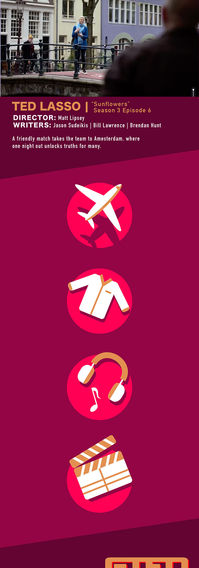
Buttons and functionality were kept minimalistic as possible. Universal icons were created for the travel, merch, music, and movie-info buttons. For merchandise in a scene you simple tap on the object.

There was an issue. There was only 1 video and 1 pic available that showed the screen in this setting, but I needed another shot for the close up of a hand holding a phone: one without the Netflix on screen and one without the people.
So, through the AI functionality in Photoshop and some blurring/clone stamping I took the people out and completed the space within. You'll notice that it is not perfect. Terribly done in fact. That's because I knew that the background was out of focus, the dimensions would be formatted to vertical, and the hand in the foreground would cover up the majority of the scene. This image was imported into After Effects as a back plate for the foreground.
In After Effects the .mp4 of the TV clip was turned into a 3d plane and adjusted to match the angle of the screen and would have to match what the phone in the foreground was seeing.
The hand holding a phone was a separate picture from Pexels as well which was rotoscoped. Then several masking techniques (including keying) were used in order to extract (and track) the images on the phone screen.
This fictional company needed a logotype and logomark designed for the app button. Brand colors were kept simple as it's functionality. The color types were monochromatic with a pop of orange. It does seem a bit jarring, but that fit in with the exclamation and spirit of the brand name. There are a lot of apps that contain the color blue so the deep reds were a nice departure.
Below are also a few designs that were considered, but never fleshed out. You can see the testing of some color combinations. 4 have all the letters in one emblem. 1 contains a hidden arrow in the G representing the spirit of "G.T.F.O", but it didn't encompass the feeling from the app, which in the end became 2 excalamation marks.


These are the layouts of the screens: Launch Screen, Menu Screen, Travel Screen, and finally the shopping screen.
Assets were created in illustrator and imported live in to After Effects. Icons are all custom other than the airline logos obviously. Each element that was eventually animated were left as separate layers in order to have control in After Effects.
Each screen was meant to retain it's simplicity and functionality.
*Scroll button below
bottom of page


